Email builder
Easily create beautiful emails with our drag-and-drop builder
The email builder allows you to build high-quality, responsive email designs. You can open the builder from the Email tab of the campaign builder, by clicking on Create with builder.
Understanding the builder: settings, rows and content
One of the biggest strengths of the drag-and-drop builder is that it provides creative professionals with tremendous design flexibility.
This is achieved by separating the concepts of:
- Settings: which apply to the entire message.
- Rows: rows of content in the message, which can be added, removed, copied, and moved.
- Content: individual content blocks: images, text, buttons, etc., which also can be added, removed, copied, and moved.
Settings
These are the general settings for the message, which are inherited by the rows and content blocks, which is very useful to build a coherent message very quickly.
It is possible to configure the following elements:
- Content area width: set the display width for your content area. This is used to limit the message display when the device has a screen larger than the width setting. You can think of it as a maximum width for that content area. On small devices, it will be ignored.
- Content area alignment: select whether the content is centred or left aligned
- Background colour: the default background colour for the message. You will be able to override it in any row, column or content block when setting properties for those elements.
- Content area background colour: the default background colour for the content area, which is the area for which you set the width above.
- Default font: the default font family that all content elements in the message will inherit. It is possible to override this selection at the content block level.
- Link colour: the default link colour that all links will inherit unless you override it for individual elements.
Rows
This tab allows you to select different types of rows to insert into the message.
Rows are structural units that define the horizontal composition of a section of the message by using columns. You can use from one to six columns within a row.
Using more than one column allows you to place different content elements side by side.
You can add any number of rows to your messages (by drag and dropping them), regardless of the template you selected when you started.
Every row has its own settings, which gives you the kind of flexibility that was previously only achieved with an email template created from scratch with HTML and CSS. For example, you can select a background colour for the entire row, only the message area, or a specific column within it.
Content
This section includes a series of tiles that represent the different kinds of content you can use in your message. More will become available in the future.
To use them, just drag one into a column, it will auto-adjust to the column width.
Every content block has its own settings, such as granular control on padding. The right-side panel automatically switches to a property panel for the selected content element.
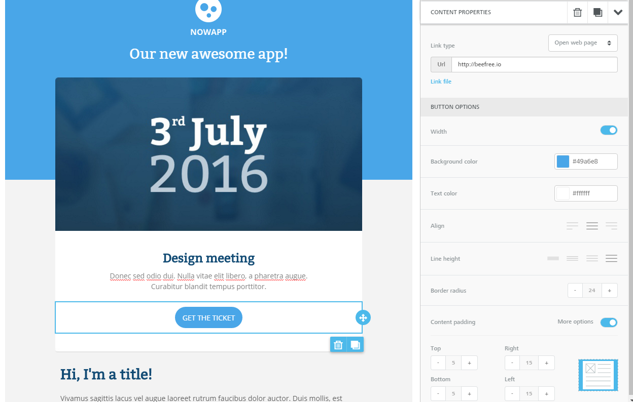
When working on a new email, start with the Settings tab to set general options for the email, add rows, and then add content blocks to your message.
Selecting rows and content blocks
Depending upon the area you want to edit, you may need to select a content block or row.
Interacting with a content block
If you just mouse over a content block (an image in the example below), the builder will show a move icon that allows you to move that content block elsewhere.
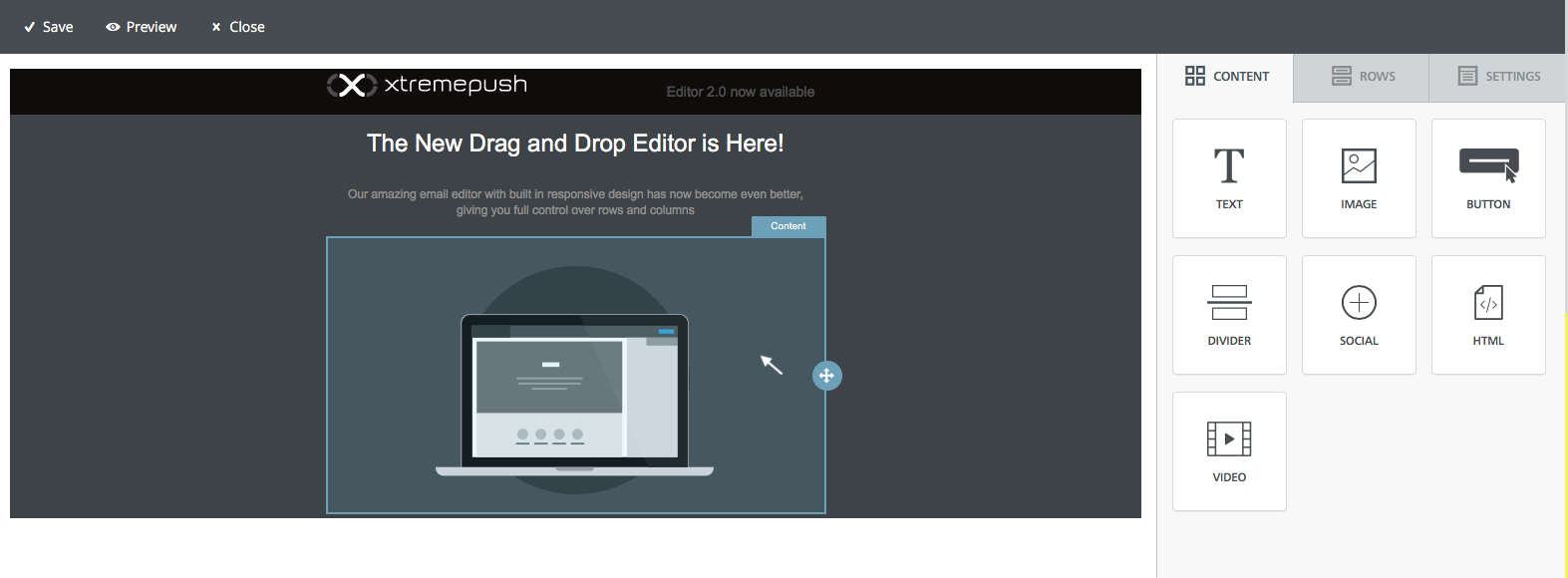
However, if you click on the content block, the content outline will be highlighted and two buttons will appear that allow you to delete the block or to create a copy . Also, the right side menu will show the properties section for that content block, where you can modify a series of properties for that element.
Interacting with a row
Mousing over an area that is free of content, (i.e. the row in which the content is located) will again highlight the outline of the whole row and show the icon to move the row within the email design.
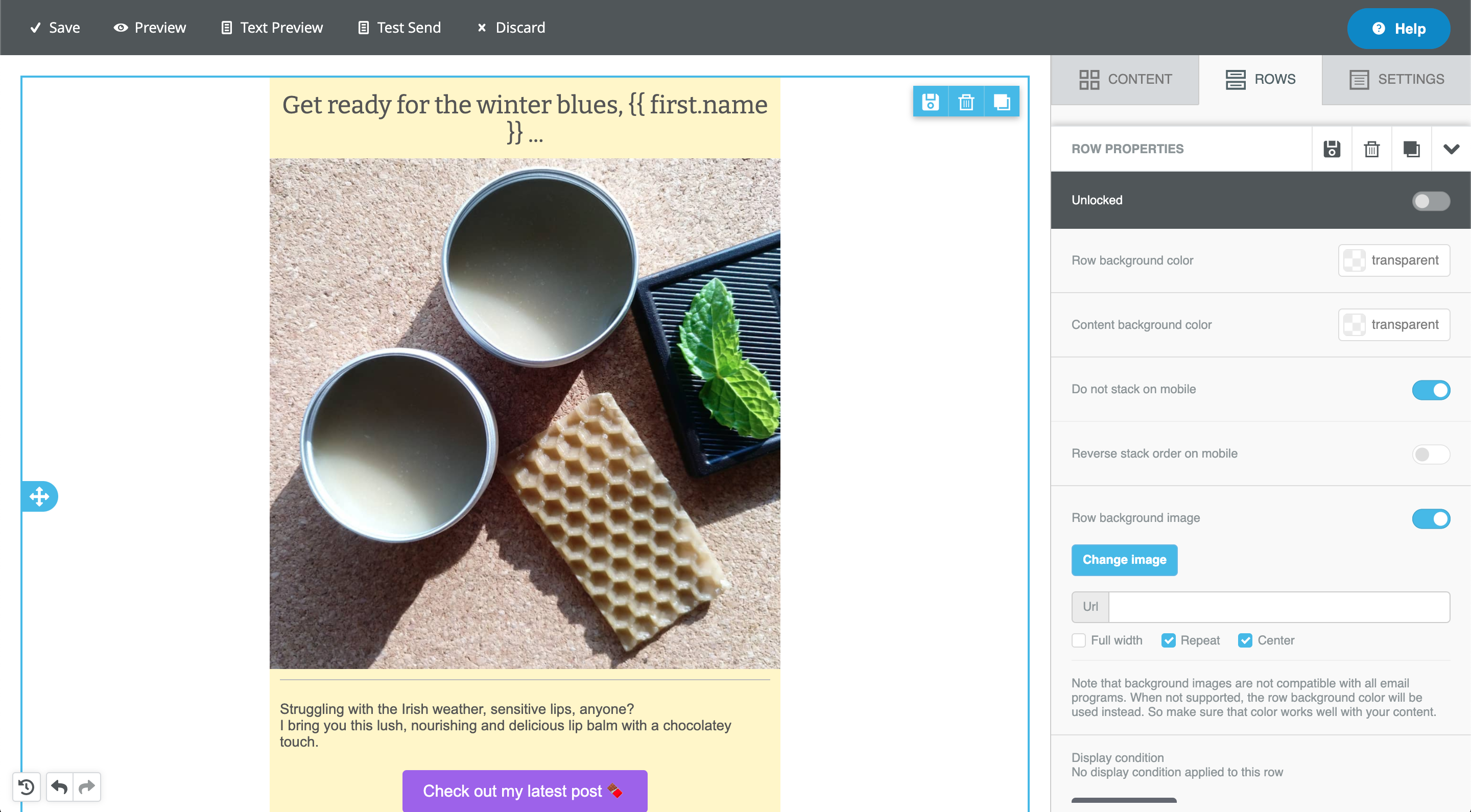
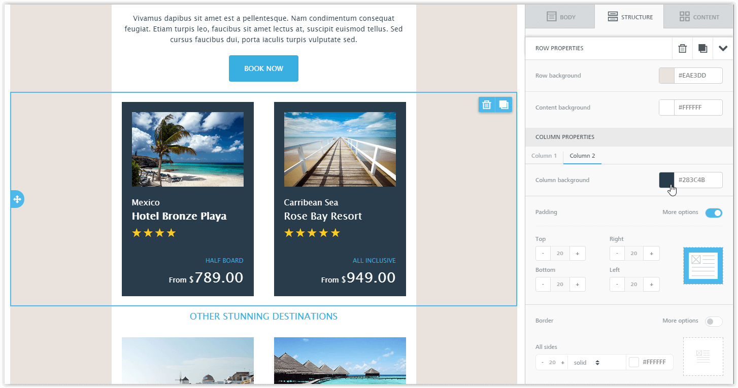
Once you click on a row, the builder will deselect any content block that had been previously selected, select the row, and show you two icons that allow you to remove or clone the entire row and all of its content. In this case, the menu on the right will display a series of properties that apply to that column within the row (which can contain more than one column). Display conditions can be applied to any row.
Editing the properties of a row
First mouse over an area of the row that is free of message content and click on it to select it.
The right side of the builder will switch to the rows tab, which shows some properties that apply to the entire row (e.g. background colour, background image, padding, etc.)...
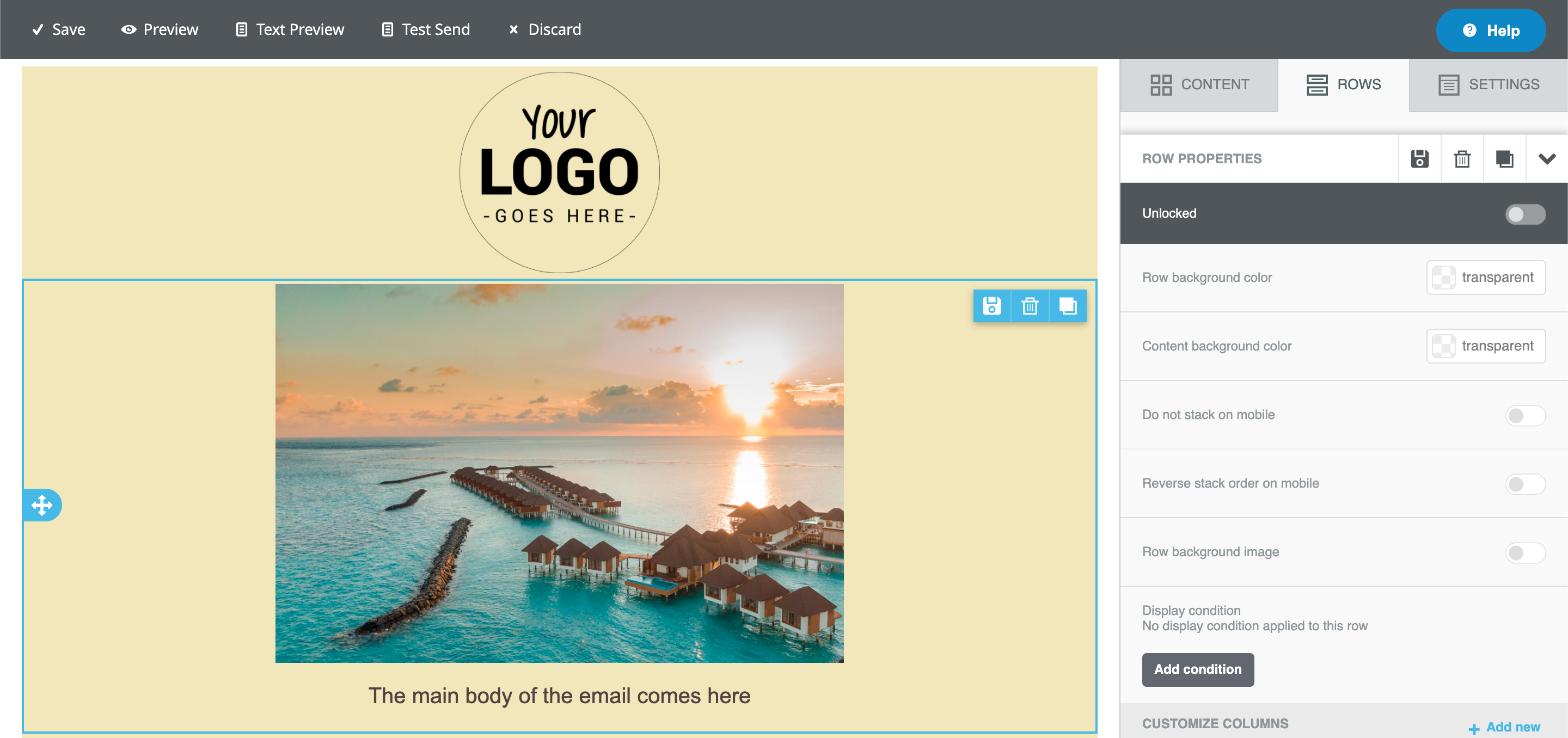
...and some that apply to each column in the row. A row could contain multiple columns, and you can control several settings independently for each column.
Once that you are happy with the settings for each row, save it by clicking on to reuse it for future templates
Previewing the email
To generate a preview of the email, on the top of it click on Preview. This allows you to see a preview of how the email would look like in the desktop and mobile version. Enabling the dark mode preview slider allows users to simulate the experience of rendering designs on devices with dark mode enabled.
Dark modeDark mode is not standardised across email clients. The dark mode preview allows you to get an idea of how the email would look like with a full colour inversion (light colours become dark and dark colours become light), but for best results it's always recommended to test your email by sending it to different email clients.
Text preview
Click on Text preview to see a text only version of your email.
Additional features
We have a full documentation section on working with specific features within the builder:
Updated 6 months ago