On-site content
Engage users navigating your website with our versatile on-site channel
In the on-site tab you can design the message that will be sent out to the website users when an event is triggered.
Create a new message from scratch, selecting one of the two styles available: Alert or popup. Review our content guidelines for best results.
Alert
Alerts are simpler messages that appear on the top right corner of the browser, similar in aspect to a web push notification. Alerts include a title, body and an optional icon. If you don't set an icon from the campaign, your website icon will be shown by default.
You can select the default action that will happen when the end user clicks on the alert:
- None: selected by default.
- Open URL
- Go to deeplink: take users to a certain part of the app. See our deeplinks guide for more details.
- In-App message: take users to an in-app message. A new in-app tab section will be created in the campaign.
- JavaScript: execute a custom JavaScript command.
JavaScript default actionDo not add HTML
<script>tags here, just put the JavaScript you want to execute. For example, if you'd like to show the browser's web push prompt to ask users to subscribe to web push in response to an onsite campaign (read more on how to create a two-step prompt here), you would need to include the following JavaScript:
xtremepush('prompt');
Using content elements
You can add emojis and dynamic content to your alert on-site message.
Click the smiley icon to display a list of emojis and click the one you want to add to your message.
Click on the user icon to add data from your user attribute fields. Type the name of the field you want to use, or select it from the presented pick list.
Click on the code icon to add content snippets. Type the name of the field you want to use, or select it from the presented pick list.
Popup
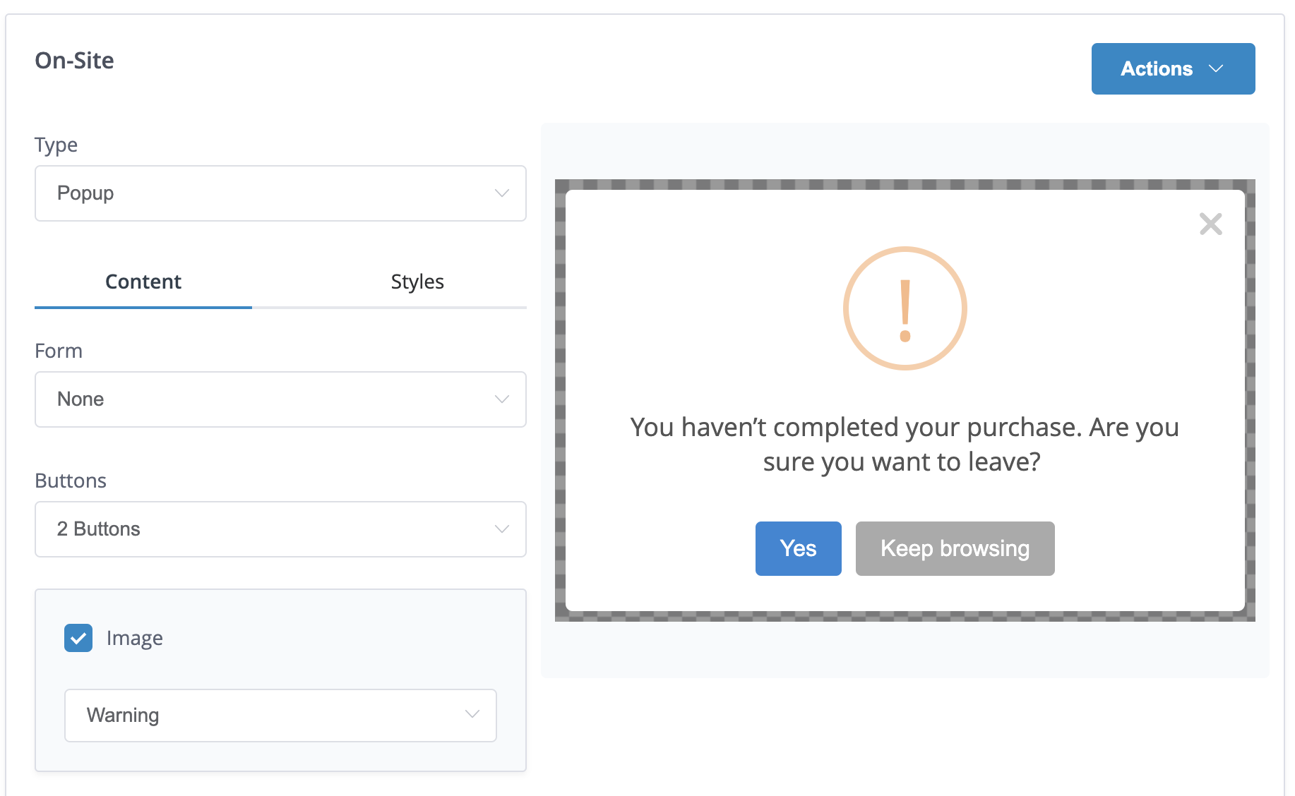
Popups are richer messages with more options. You can include the following elements in your popup message: image, title, text, footer and up to two buttons.
Toggle between the content mode (selected by default) and the style mode to customise the aspect of your message.
Form
To use a specific form to capture information choose the type here. Read more about how to set up an email capture form.
Buttons
Buttons include the following elements:
- Label: the text that will show in the button
- Default action: determines what happens when the user clicks on the button. Available fields are none, submit, dismiss, redirect to an URL or execute a custom JavaScript.
- Save: set an attribute against this user profile or add it to a user list (both attributes and user lists need to have been created beforehand).
- Subscribe: subscribe the user to a subscription category. This option will only show for projects that have subscription preferences enabled.
- Trigger: trigger a new
real-timeevent when the user clicks on the button.
Xtremepush identifiersOnly User Lists that use Xtremepush identifiers (Profile ID or Device ID) are available to use with the Add to list option, as other identifiers (such as User ID and email) are optional and may not be set for all user profiles.
Submit actionThe submit action type should only be used when using the Email capture form option.
Image
Configure an image for your on-site message (uploading it directly or including the image URL) or set different pre-configured icons for different message types: success, error, warning, information, and question.

The warning image has been selected in this example.
Text elements
Each of the text elements can be personalised: you can enter raw HTML, change the colour, size and format and include data from your user attributes for personalisation by clicking on the user icon.
Inline Channel Opt-in
This section can be used to resubscribe users for whom you have contact details but who may have at some point unsubscribed. For more information review our dedicated use case guide.
Preview the message
Regardless of the chosen style, the right-hand pane will show a preview of your message. If you are using dynamic data, you will need to send a test message to see the data rendered.
After you have finished creating your message, you can manage its trigger event from the Events tab.
Email capture form
To build an email capture form you need to select the Popup message type, and in the form field choose Email capture. Two additional fields will be now displayed:
- Marketing opt-in: choose whether this user will be automatically email subscribed or not on submit.
- On submit: define what happens when the user submits their email. By default, the system will show a confirmation, but it is also possible to dismiss the on-site message or to execute a custom JavaScript command.
Include a Submit buttonYou must include at least one button whose action is Submit to be able to capture the email addresses and pass them on to the platform.
Email can only be captured for users with a user ID set. Review our dedicated guide on how to set the user ID for your recipients.
Multi-language and variants
It is possible to create a multi-language campaign with new titles and messages based on the languages selected at the campaign level. It is also possible to do a split test to see which variant has a better engagement. Both options are enabled and configured from the Setup tab.
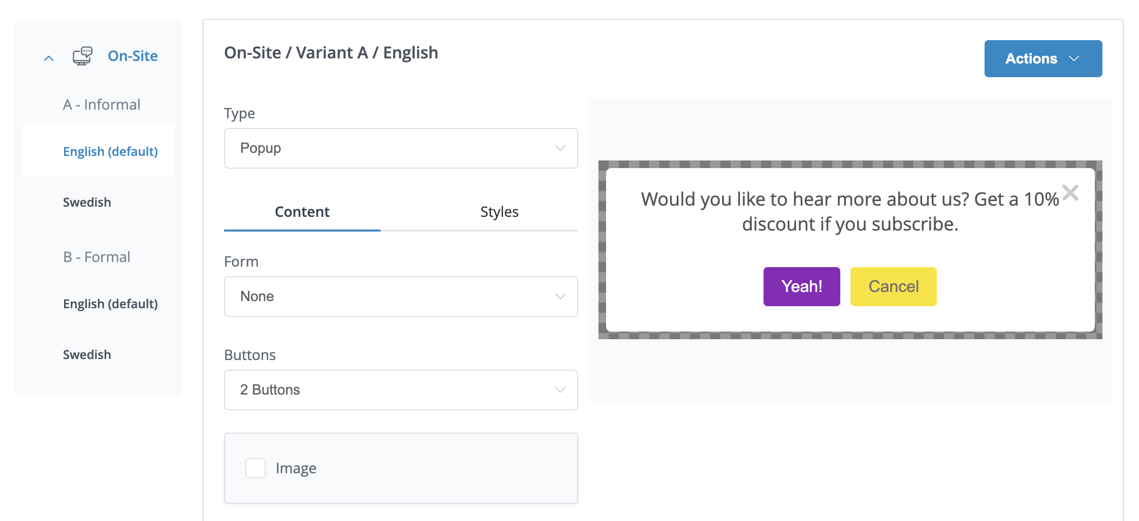
The languages you have selected, together with the variants selected are shown on the left side of the campaign. To be able to identify with which variant and language you are working, this information is shown on the top of the screen.

This example shows a multi-language campaign for English and Swedish speakers, combined with split testing. Currently, the content shown is for the English version of variant A.
Actions
The Actions button allows to Apply a template that has been previously created from Content > Templates to a campaign and to copy the content from a specific language & variant. To copy the content, click on Copy From when you are on the variant and language where you want to apply the content. The system will show the available options to copy from.
Updated 6 months ago