In-App messages creative guidelines
Maximum file sizeAll files uploaded to the platform must be smaller than 2MB.
We have provided templates for designing creatives for portrait and landscape In-App messages.
On the creative screen of the in-app message wizard, you can add a background image and some optional buttons, which Xtremepush resizes for all devices.
The images below give some guidelines for optimal image sizes for in-app messages; use them as a base for your own images.
Xtremepush uses safe zones to enable you to optimize your image message content across the full spectrum of devices. Template images for portrait and landscape backgrounds are provided below. Click on the images to download them. The safe zone for your content is the blue area. If the core content of your creative is inside the safe zone then it will work on all devices (see exception: iPhone X).
You can always test that your content is visible in the preview area of the wizard.
- Suggested dimensions: 1500x2000 px (portrait); 2000x1500 px (landscape)
- Valid image formats: PNG, JPG (JPEG), GIF (animated too)
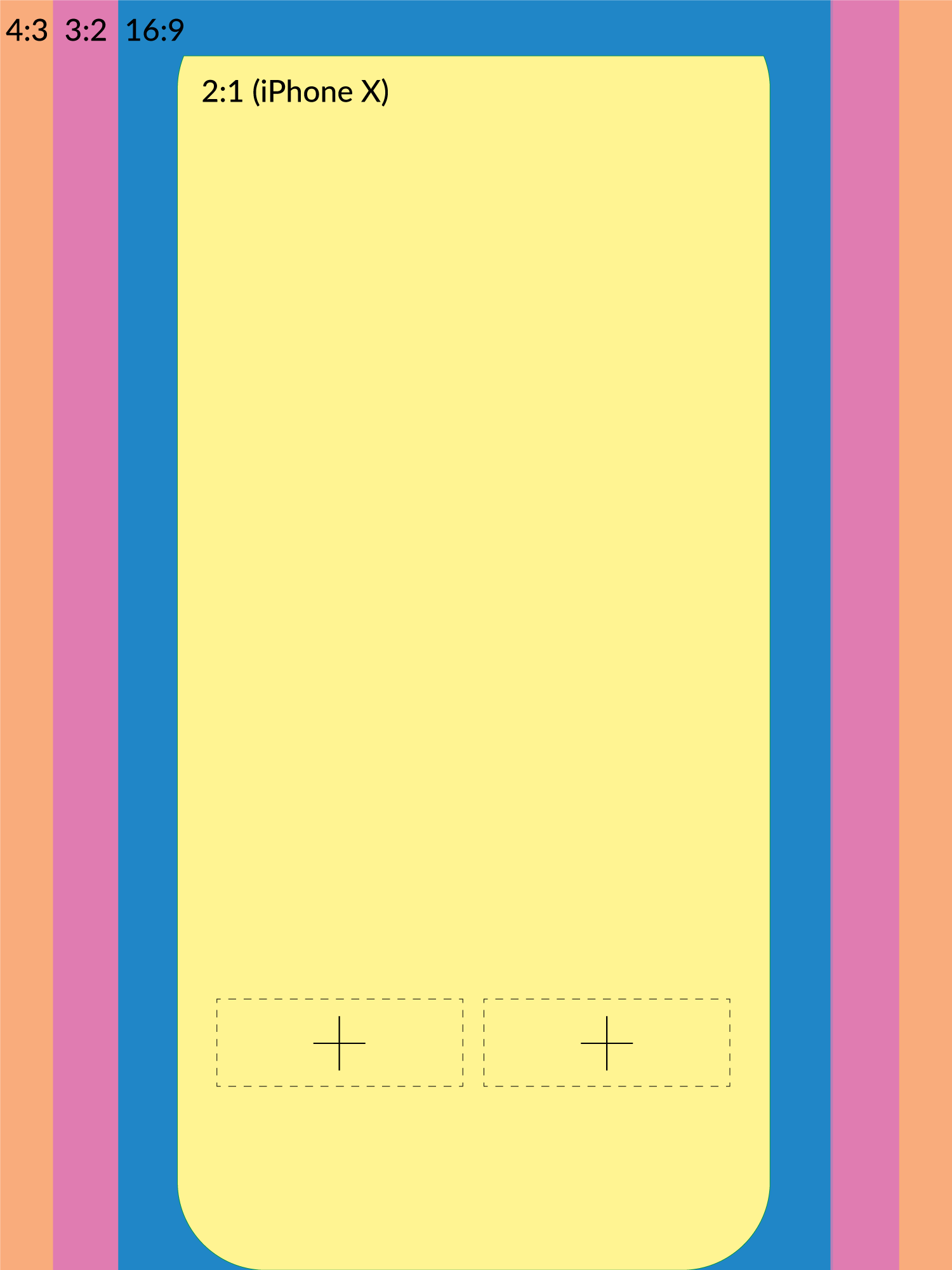
Portrait template
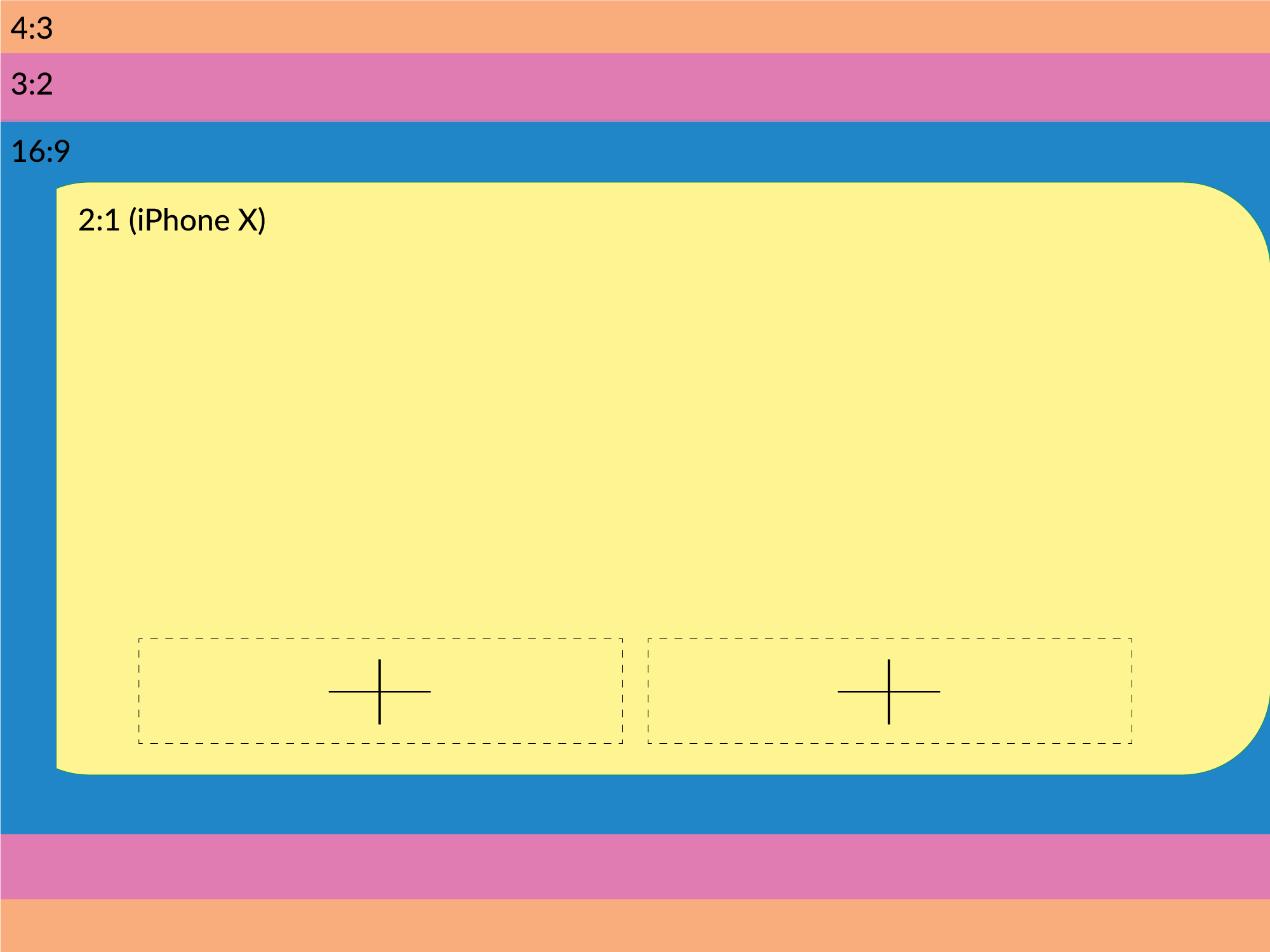
Landscape template
Buttons
Buttons need to be properly sized in order to stay in the safe area. They will be resized with the main image so once they work within your design, they will work on the final message.
It is always helpful to place a cross or other placeholder in the main image to place the buttons in an easier manner (see second half of the tutorial - campaign creation).
Here are some examples of test button images, downloadable below.
This example button fits the placeholder we put in the portrait image

This example button fits the placeholder we put in the landscape image
Why are there three bands but only one safe area?
Xtremepush will resize the main image keeping 100% of it's longest side. Therefore, the width will be cropped and the cropped portion will depend on the device aspect ratio, not the resolution.
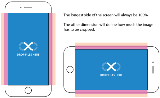
If you want to run a campaign across every device the blue area will guarantee that your content will be displayed. If you are interested in only certain devices, let's say only iPads, the safe area can be largeras all iPads have an aspect ratio of 4:3 and you can use the entire image as you want.
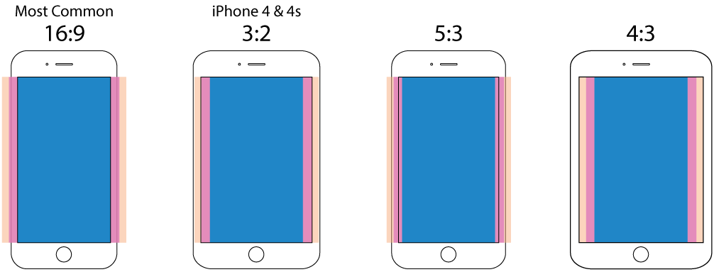
Mobile aspect ratios and safe areas
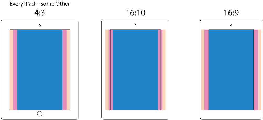
Tablet aspect ratios and safe areas
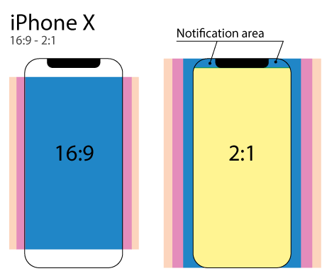
iPhone X
By default, this model would constrain the web view used to display the message in a central 16:9 area.
It can anyway be forced to display the message using the full screen.
In this case, the message must be designed using a narrower safe area, avoiding also the top area because of the presence of the notification bar and top notch.
The message will be displayed in a 2:1 ratio screen.
Banners
The safe areas are still valid, but you need to specify a different heigh for each different width used to fit the banner on every device.
For instance, if set as from image:
- 50px while MIN WIDTH = 0
- 100px while MIN WIDTH = 480
- 60px while MIN WIDTH = 728
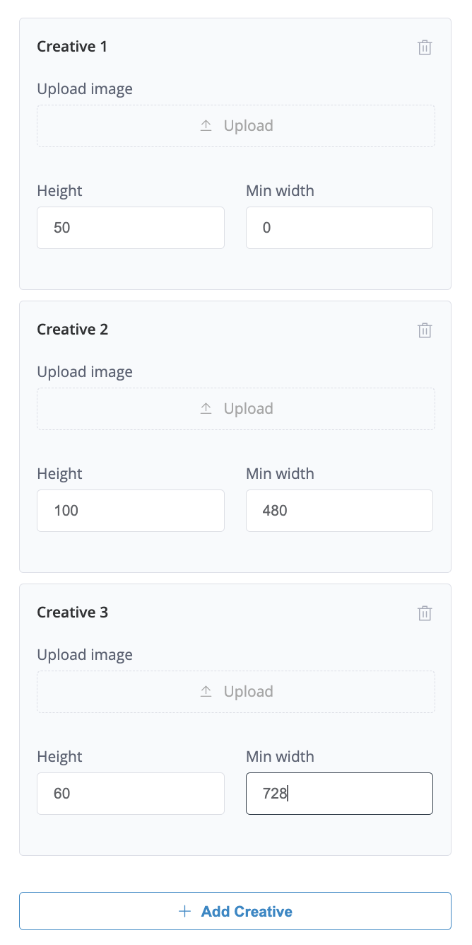
The result will be this:
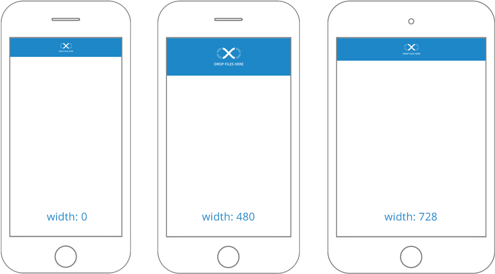
Each creative image can be different, otherwise, one image will be used for different screen sizes.
In this case, each creative image will keep the specified height and the image will:
- Have space on the side (if it is smaller than the screen side)
- Be cropped from safe areas specs (if it is bigger than the screen side).
A standard close button will be placed by Xtremepush on the banner in an accessible position.
Video tutorial
Take a look at the following tutorial to learn how to create the perfect images for your In-App messages and how to upload them into your campaign.
Resources
All the assets are tested and can be downloaded and used as the base for your creative:
Updated 6 months ago