Hiding content on mobile devices
Making your email designs responsive
Mobile design is not only about the responsiveness of the layout, but also about having the appropriate content in the right context.
An email that may yield excellent results on desktop screens may not work as well when the user needs to scroll on their mobile device to reach the call to action.
The best way to solve this challenge is to hide unnecessary design and/or content elements when the message displays on mobile devices.
Content block options
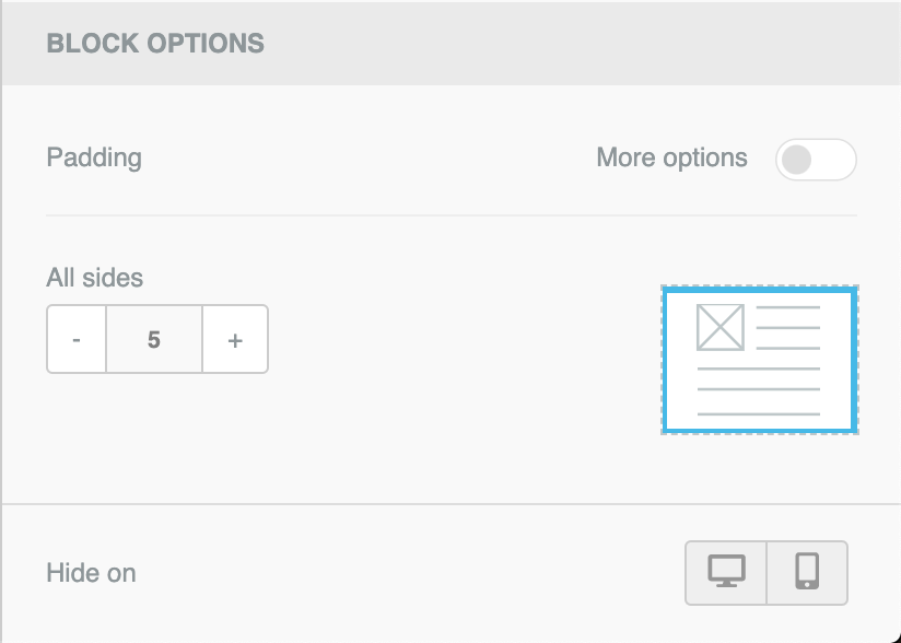
All content blocks include a Hide on section in the property panel that allows to hide content on desktop or mobile. To use it, simply scroll down in the right hand panel until you see the Block options section.

You can check the result of turning this property on for a specific content block by going into the preview and selecting the mobile view. You will see that as you toggle between desktop and mobile the content blocks for which "Hide on mobile" has been turned on will not be shown.
Updated 6 months ago