Android inbox
Integration guide to implement an inbox in your Android app
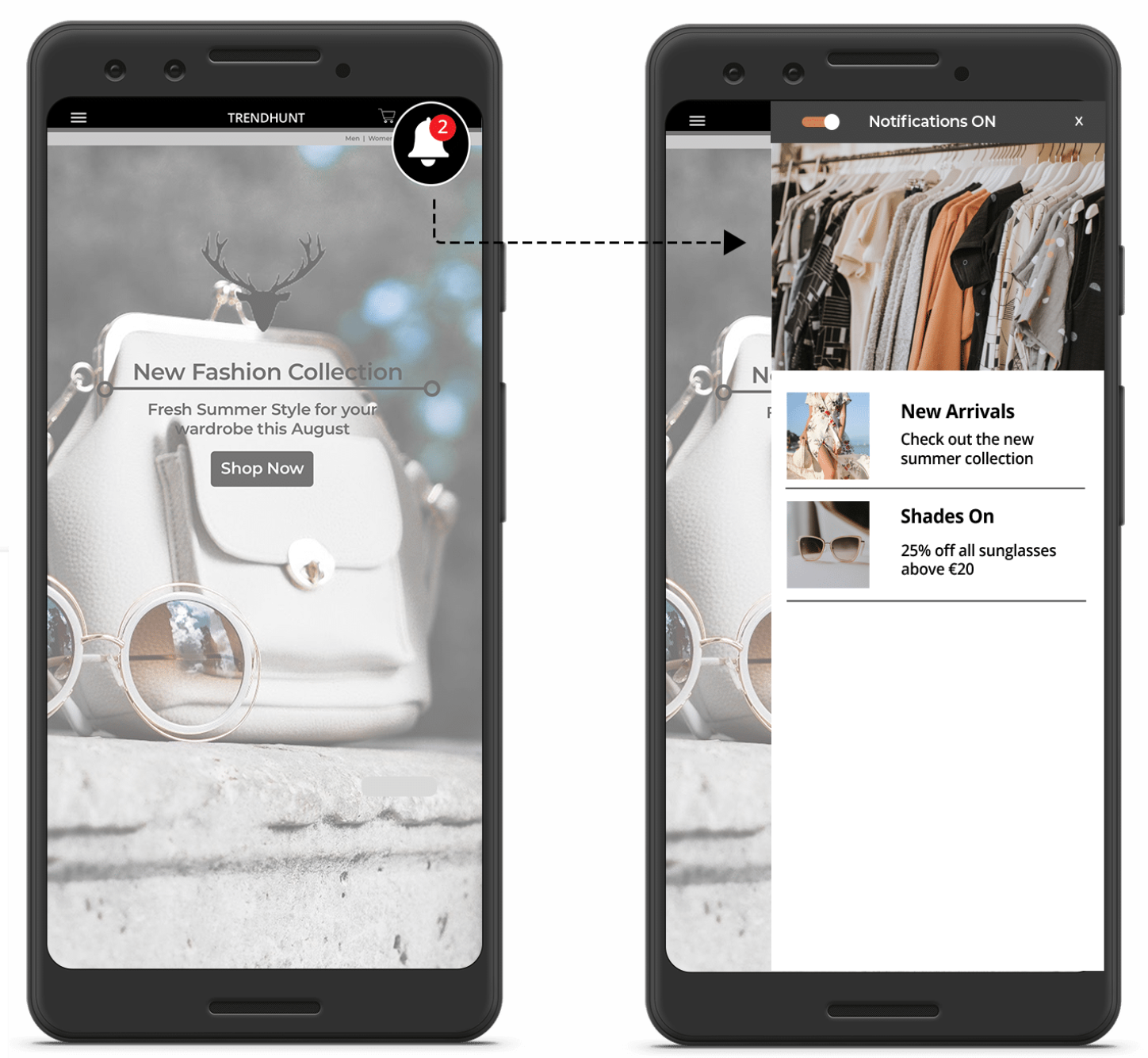
The inbox channel allows you to persist notifications you send to a user in an inbox in the app. It also allows you to send messages to users who have not opted into push notifications as these messages come into the inbox like a feed when the app is opened. You are also not constrained by the push notification format and can use a richer style in your inbox messages.

Example of the inbox integrated in an Android app.
Integration guides for Inbox functionality in Android apps below.
Make sure you have setup the inbox on the platform before you start, this is a prerequisite. Review our inbox quick start guide for more details.
Basic configuration
Enabling the inbox in your Android app
In the standard integration described in the Android integration guide the inbox is switched off. It can be turned on using the setInboxEnabled method. In your Android app, where you initialise the PushConnector objects, add the following:
.setInboxEnabled(true)As shown below:
mPushConnector = new PushConnector.Builder(XPUSH_APP_KEY, GOOGLE_PROJECT_NUMBER)
// ...
    .setInboxEnabled(true)
// ...
    .create(this);
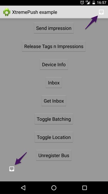
You will also need to add a UI element (a button) to launch the inbox. When tapped, this button will open the inbox. You may, for example, want to add an inbox icon to your action bar menu or elsewhere in your activity:

To add the default ImageButton into the app's action bar, override the onCreateOptionsMenu function in your Activity and call the inflateInboxMenuItem function as seen here:
@Override
public boolean onCreateOptionsMenu(Menu menu) {
    PushConnector.mPushConnector.inflateInboxMenuItem(menu, this);
    return true;
}
At this point, the inbox is fully integrated into your app and can be opened by clicking on the icon in the action bar menu. Additionally, badges with a count of new items in your inbox will be displayed automatically on the inbox button, as seen here:

Configure proguard rules for the Inbox
If you are using Proguard rules for building your release version of the app, the inbox functionality needs an additional set of rules. Please add the following to your proguard-rules.pro file:
# Required for inbox functionality
-keepclassmembers class * {
 @android.webkit.JavascriptInterface <methods>;
}

# Required for inbox functionality
-keepattributes JavascriptInterface
-keep public class ie.imobile.extremepush.ui.InboxActivity$InboxInterface
-keep public class * implements ie.imobile.extremepush.ui.InboxActivity$InboxInterface
-keepclassmembers class ie.imobile.extremepush.ui.InboxActivity$InboxInterface {
 <methods>;
}
The full list of Proguard rules required for the Xtremepush SDK can be found on the Android Integration page.
Advanced Configuration Options
There are some advanced configurations options, described here, that allow you to perform the following tasks if necessary for your app:
- Change the inbox button icon and/or set the icon colour
- Disable badges on the inbox button
- Change the badge background and text colours
- Place the inbox button somewhere other than the action bar menu
- Use your own button for opening the inbox
Each of these options will now be described in turn:
Change inbox icon or icon colour
Similar to how the notification icon can be configured for your app, the setInboxIcon function can be used for changing the icon on the inbox button. It can also be used to change the icon's colour too.
mPushConnector = new PushConnector.Builder(XPUSH_APP_KEY, GOOGLE_PROJECT_NUMBER)
    .setInboxEnabled(true)
    .setInboxIcon("iconfilenamewithoutextension")
    .create(this)
This will set the icon for the inbox button with an image from the res/drawable folder of the app. In this example, the library will try to look for a file called iconfilenamewithoutextension.jpg or iconfilenamewithoutextension.png*etc, in the res/drawable folder. If the file cannot be found, the default inbox button icon will be used instead.
The library will also search for a "color" entry with the same name in one of the XML files in the res/values to use as a colour filter over the icon. In this way you can set the colour of the icon. If no matching colour is found in res/values, then no filter is applied to the icon. The entry in res/values could look like the following:
<!-- color int as #AARRGGBB (alpha, red, green, blue) -->
<color name="iconfilenamewithoutextension">#ff2266ff</color>
Here, the icon has been changed and a colour filter has been applied to it:
Disable badges on the inbox button
You may wish to disable the badges on the inbox button within your app. To do this, please use the setInboxBadgeEnabled function as seen here:
mPushConnector = new PushConnector.Builder(XPUSH_APP_KEY, GOOGLE_PROJECT_NUMBER)
    .setInboxEnabled(true)
    .setInboxBadgeEnabled(false)
    .create(this)
Change the badge background and text colours
The default colours for the inbox button badge consists of a red background and white text. If you wish to change these values, you can use the setInboxBadgeColors function, passing in a background and text colour respectively as parameters. The example below shows the code required for setting blue as the background colour and yellow as the text colour:
mPushConnector = new PushConnector.Builder(XPUSH_APP_KEY, GOOGLE_PROJECT_NUMBER)
    .setInboxEnabled(true)
    .setInboxBadgeColors("#ff0000ff", "#ffffff00")
    .create(this)
Place the inbox button somewhere other than the action bar menu
The steps above have described how the inbox button can be added to action bar menu in the app.
The same button can also be added elsewhere in the app, instead of (or in conjunction with) the button in the action bar menu. To place our inbox button somewhere else in your app other than the action bar menu, there are three steps involved:
First, add a reference to the inbox button in the desired location in your layout XML files. This requires a single line:
<include layout="@layout/xp_inbox_button" />Secondly, for any Activities using the above XML layouts, an onClickListener will need to be added to the inbox button. This can be performed by implementing View.OnClickListener in the Activity and then adding the following to the onCreate function of the Activity:
ImageButton inboxButton = (ImageButton) findViewById(R.id.xp_inbox_button);
inboxButton.setOnClickListener(this);
Finally, in the onClick callback function, open the inbox using the openInbox function, passing in a reference to the activity:
@Override
public void onClick(View v) {
    switch (v.getId()) {
        case R.id.xp_inbox_button:
            mPushConnector.openInbox(this);
            break;
    }
}
Use your own button for opening the inbox
If you wish to use your own button for opening the inbox, this can be achieved using the openInbox function. This can be seen just above, where the following code is used in the onClick function of the Activity class.
mPushConnector.openInbox(this);If you wish to handle the badge numbers too, we have created an InboxBadgeUpdateListener interface that can be implemented by your Application subclass as follows:
public class MyApplication extends Application implements InboxBadgeUpdateListener {When this is done, your Application will receive a callback whenever the inbox badge number is updated. Here is the function that will be called on a badge number update:
@Override
public void inboxBadgeUpdated(int badge, WeakReference<Context> uiReference) {
    //Handle badge number here
}
A reference to this implementation of the InboxBadgeUpdateListener also needs to be passed through to our SDK when initialising the PushConnector object in your app. This can be achieved using the setInboxBadgeUpdateListener function:
mPushConnector = new PushConnector.Builder(XPUSH_APP_KEY, GOOGLE_PROJECT_NUMBER)
    .setInboxEnabled(true)
    .setInboxBadgeUpdateListener(this)
    .create(this)
Updated 1 day ago